
The Best Responsive Viewer to Use on Your Squarespace Website
Responsive design is a key focus of my Squarespace web design process. Websites need to look great across all devices—mobile, tablet, and desktop. Squarespace provides a mobile view feature, and the Fluid Engine update allows adjustments for mobile layouts independently of desktop ones. However, the mobile view doesn’t accommodate all screen resolutions, and there’s still no tablet-specific view. So how do I ensure the websites I create work well across all displays? I rely on my go-to Chrome extension for checking responsiveness. Easy! I use my favorite responsiveness-checking Chrome extension: Responsive Viewer.
What is Responsive Viewer?
Responsive Viewer is a simple and powerful tool that allows me to quickly and easily check the responsiveness of any website on a variety of different devices. It's a browser extension that can be easily added to Chrome to test the responsiveness of any website, whether built on Squarespace or any other platform.
Why Squarespace Designers Need a Tool Like This
Here’s the thing—Squarespace’s built-in mobile view is helpful, but it’s limited. Especially since:
There's no native tablet view
Not all screen resolutions are available
It doesn’t reflect real browser behavior on mobile devices
If you're like me and you're tweaking every section of your site to look just right, you need more than what Squarespace gives you out of the box.
How to Use Responsive Viewer?
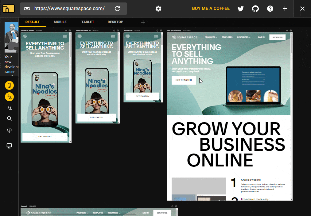
All you need to do is install the Chrome extension and then open the website you want to check and launch the extension. We can see in the example below that the default tab of the extension will display a grid view of the most common screen resolutions across mobile, tablet and desktop.
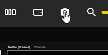
In addition to the default presets you will have the ability to view other resolutions by adding them through the inactive screens tab. I love this function because it allows me to quickly and easily add any resolution to my review tab. The extension also offers the ability to rotate the device between portrait and landscape mode on any resolution, which is handy when you’re optimizing for mobile and tablet. Once you’re done reviewing the page, click the extension button in your Chrome extensions tab to close Responsive Viewer and return to the normal viewing mode.
How to use Responsive Viewer with Squarespace websites?
For best results with Squarespace websites, I recommend reviewing your website through the front end or on a Private/Incognito tab. This will display the most accurate version of the website and what your visitors would be seeing. Reviewing a website through the back end where the layout editor is open will not be as accurate.
What Makes Responsive Viewer Standout from Other Responsiveness Checkers?
Here’s why I use Responsive Viewer on every single Squarespace project:
- Sync scrolling
- screenshot multiple displays
- inspect code on all open displays
- It works with password protected websites
- create your resolution presets
Sync scrolling is a function which synchronizes scrolling across all resolution tabs you have open, enabling you to simultaneously compare how different sections of a page look in one go as opposed to scrolling each tab individually.
The screenshot function enables you to take a screenshot of all the open displays. You can also select whether you want to screenshot the sections that are visible on your screen or screenshot the entire page. I find this extremely helpful when I’m trying to showcase the responsiveness of my websites in my portfolio with just a few simple clicks.
You can inspect the code of each open display. I love this function because I can inspect the mobile and desktop code of the same page without needing to switch the resolution in Chrome dev tools.
I’ve previsouly used responsiveness tools that didn’t work with password-protected Squarespace websites because those tools were static and not dynamic. With Responsive Viewer, all you need to do is enter the password of the Squarespace website you want to review and then launch the extension. As opposed to said tools it will not refresh the page and trigger the password wall again. This is crucial for my build process as most of the websites I work on are password protected until they’re launched.
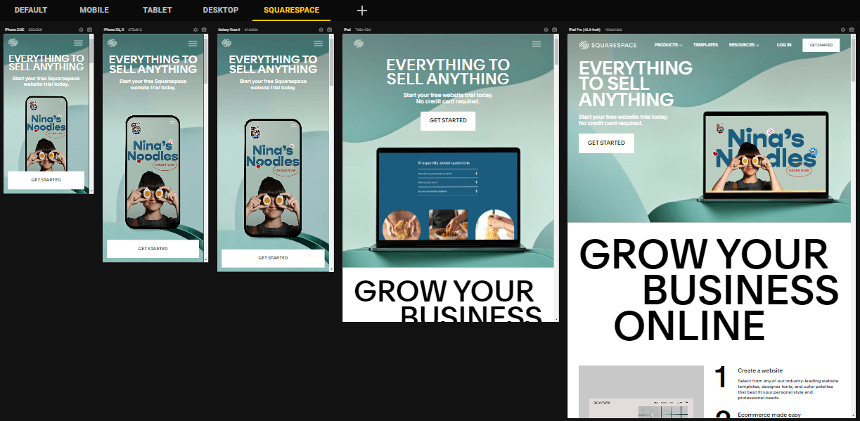
You can create your preset tab and add only the resolutions you want to see. There are specific resolutions I always check my websites for, so I used this feature to create a Squarespace tab and included said resolutions. This helps me declutter the extension and only shows the displays that I need.
So there you have it folks! Responsive Viewer is an essential part of my web design toolkit. I genuinely don’t launch a Squarespace website without using Responsive Viewer. It’s saved me hours of guesswork and helped me deliver websites that look polished everywhere.
If you're a Squarespace designer (or even just building your own site), this extension is worth installing.


![How to Change Images on Hover in Squarespace [Simple Guide]](https://images.squarespace-cdn.com/content/v1/671a6d15050267628d1bfe3a/1729955141069-JY8TZ37717WLM0T405BZ/Minimist+Web+Design+-+Squarespace+Designer+and+Developer+-+Change+Fluid+Engine+Images+on+Hover.png)


